
If your website is not optimized for mobile devices, you are losing search visibility. This is why Google now mainly uses the mobile version of a site’s content for indexing and ranking. This shift, called mobile-first indexing, reflects how people really access information.
For SaaS companies, user acquisition and retention often start with a search query. So, a mobile friendly experience is non-negotiable. This guide shares practical steps. You will learn to optimize your website for the mobile-first era. This is how you meet your audience where they are. Optimizing for mobile-first indexing is critical for your SEO success in 2026 and after.
What is Mobile-First Indexing?
Mobile-first indexing means Google uses the mobile version of your content to index and rank it. In simple words, Google’s crawlers see your site as if they were visiting on a mobile phone. Before this change, the search engine built its index from the desktop versions of websites.
Now, the mobile site is the starting point for what Google indexes. It serves as the baseline for how Google checks rankings. If your mobile site provides a poor experience or lacks key content that your desktop site offers, your search performance will suffer. This change is major in how search works.
Why is Mobile-First Indexing Important for Your Website?
Ignoring mobile-first indexing hurts your website’s ability to rank in search results. Google ranks mobile friendly sites higher, and non optimized sites get pushed down in the results. Recent numbers show why this matters. Recently, Statista reported that mobile devices made up almost 62.54% of all website traffic. Most users visit your site on a small screen.
For SaaS businesses, this is huge. Someone may look for a software solution on their phone. If your site is not optimized for mobile-first indexing, it will not be found. A poor mobile experience can also increase bounce rates, which signals to Google that your site is not useful. Even John Mueller says:
“What matters for Google is not that a website is attempting to give users a good page experience but rather if it’s actually giving users a good page experience.”
Focusing on your mobile site is no longer just an SEO task but it is a main business need.
How to Check if Your Website is Mobile Friendly?
Before you can fix anything, you need to know if you have a problem. Checking whether your website is mobile friendly is the first step. Luckily, Google provides free tools to help you with this. These tools give you a clear picture of how your site performs on mobile devices.
Using Google’s Tools for a Quick Audit
- Google’s Mobile-Friendly Test – This is the quickest way to check a single page. You just enter your URL, and the tool tells you whether the page is mobile friendly. It also points out any specific loading issues it finds.
- Google Search Console: For a deeper analysis, you need to use Google Search Console. The Mobile Usability report in Search Console shows you which pages on your site have problems on mobile devices. It shows errors like,
- Text too small to read.
- Clickable elements are too close together.
- Content wider than the screen.
- Viewport not set.
Check these reports and fix any issues before they harm your rankings. This active habit is key to keeping strong mobile SEO results.
Key Steps to Optimize Your Website for Mobile-First Indexing
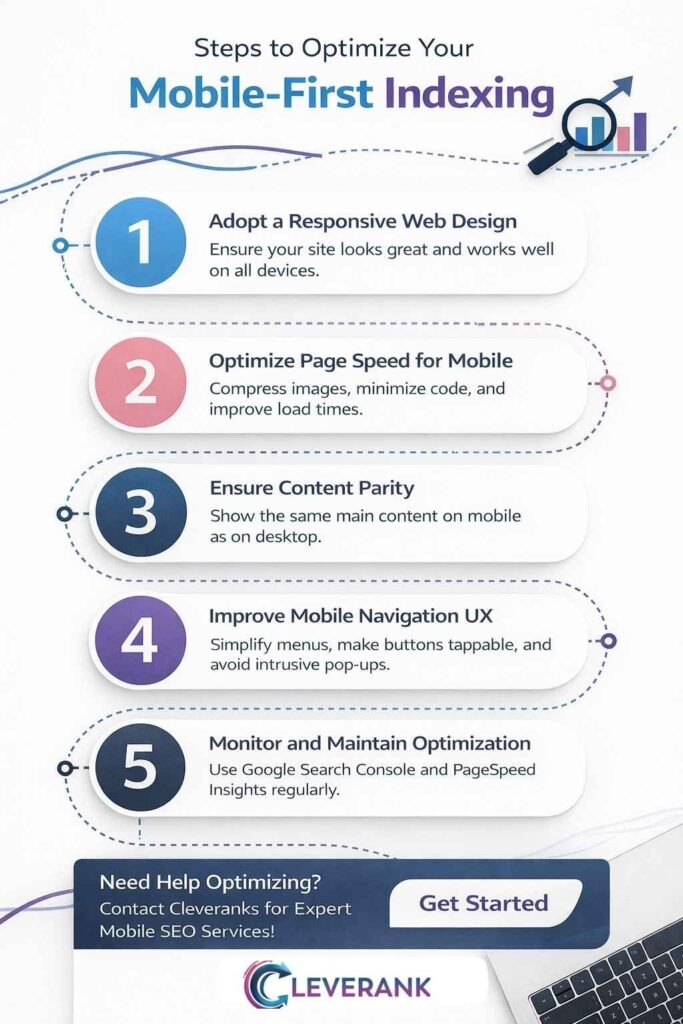
To optimize for mobile-first indexing, you must follow some basic technical and content steps. When you focus on these, you create a smooth experience for mobile users. You also meet search engine needs.
Adopt a Responsive Web Design
Responsive web design is the best approach for creating a mobile friendly website, as it allows your site to automatically adjust its layout to fit any screen size. This means you only need one website, not separate versions for desktop and mobile.
This simplifies maintenance and makes sure everyone sees the same content. A responsive design provides a consistent experience across all devices.
Optimize Page Speed for Mobile
Mobile users are impatient. This is why a slow loading page is a major reason people leave a site. According to a Google study, as page load time goes from one second to three seconds, the probability of bounce increases 32%. To improve your mobile page speed, you can do a few things.
- Compress images to reduce their file size.
- Minimize your site’s code by removing unnecessary characters.
- Use browser caching to store parts of your site on a user’s device.
- Implement lazy loading so images load only when they are visible on screen.
Ensure Content Parity
Content parity means your mobile site should have the same valuable content as your desktop site. This includes text, images, videos and links. With mobile-first indexing, if content is missing from your mobile version, Google will not see it.
You do not have to make the layout identical. You can use accordions or tabs to organize content on smaller screens. Just make sure all the important information is there.
Improve Mobile Navigation and User Experience
A solid mobile user experience UX matters a lot. So,
- Use simple, easy to follow navigation menus.
- Make buttons and links big enough to tap easily (thumb friendly)
- Pick a font size you can read (at least 16px)
- Do not use pop ups that block the main content.
A smooth user experience keeps visitors engaged and encourages them to convert. For a complete solution, Cleveranks can be your best choice for handling all these technical aspects.
How to Monitor and Maintain Mobile-First Indexing Performance?
You do not just optimize once. Mobile optimization must be checked as you go. As standards and user habits change, so should your site, and you should conduct audits often. Use Google Search Console and Google Analytics to track your website’s mobile stats.
| Tool | Metric to Monitor | Frequency |
| Google Search Console | Mobile Usability report for errors | Weekly |
| Google Analytics | Mobile vs Desktop traffic and activity | Monthly |
| PageSpeed Insights | Core Web Vitals (LCP INP CLS) | Quarterly |
| Mobile Friendly Test | Review new or changed pages | As needed |
Watch your numbers. Is mobile traffic falling? Do more people bounce after landing on your mobile pages? This warns you that something needs help. So you have to set alerts in Google Analytics for changes in mobile metrics. And stay alert so you can solve problems fast and keep a good ranking.
Common Mistakes to Avoid in Mobile Optimization
When optimizing for mobile, it is easy to make mistakes that can harm your SEO and user experience. Being aware of these common pitfalls will help you avoid them. Here are some of the biggest mistakes to watch out for.
Blocking Resources
Some websites block CSS, JavaScript or image files in their robots.txt file. This prevents Google from properly rendering your page. If Google cannot see your page as a user does, it cannot index it correctly. Make sure your robots.txt file allows Googlebot to crawl all necessary resources.
Intrusive Interstitials
Pop-ups that cover the main content can be very annoying for mobile users. This is why Google penalizes sites that use intrusive interstitials. These include pop-ups that appear immediately after a user lands on a page or while they are scrolling.
Small banners that are easy to dismiss are generally acceptable. So, avoid large pop-ups that disrupt the user experience.
Slow Loading Times
Slow page speed is a huge issue. Many SaaS sites have complex features and large images that can slow down mobile loading times. So always test your site’s speed with tools like Google PageSpeed Insights and work to improve it. Fast loading times are a critical part of a good mobile experience and a key factor for mobile SEO.
Which is the Best Way to Start Mobile Optimization?
When you are new to mobile optimization, the job can feel big. The best way is a quick audit. So, use the Google Mobile-Friendly Test to check your site’s status quickly. This shows at a glance whether your site is mobile-friendly. Fix the big problems it finds first.
For the next step, register for Google Search Console if you do not have it. The Mobile Usability report lists pages to fix, ranked by importance. Handle the major errors on your top pages, such as the homepage, pricing page, or service pages.
If your site is not built with a responsive design, switch to one as soon as you can. Responsive web design solves many mobile problems in one go. If you need expert help with this, Cleveranks is a good choice for a smooth process. Before leaving, read the key takeaways of the article.
FAQs
What should I do if my website is not mobile friendly?
If your website is not mobile friendly, the best first step is to implement a responsive web design. This will make sure your site adapts to all screen sizes. Then, you should also test your site with Google’s Mobile-Friendly Test to identify and fix specific usability issues.
How does mobile-first indexing affect rankings?
Mobile-first indexing directly affects rankings because Google now prioritizes the mobile version of a website. If your mobile site is slow, difficult to navigate or missing content, your search rankings will likely drop. This is why a good mobile experience is essential for high rankings.
What tools can I use to optimize for mobile-first indexing?
There are several great tools you can use. Like, Google Search Console provides detailed reports on mobile usability. Google’s PageSpeed Insights helps you analyze and improve your site’s loading speed. The Mobile-Friendly Test gives you a quick pass or fail assessment for any page.
Key Takeaways
- Mobile-first indexing is critical for SEO success in 2026.
- Focus on responsive design, page speed, and user experience.
- Regularly monitor and update your website to stay optimized for mobile-first indexing.